Todorov's Narrative Theory
Todorov's theory can relate to my A2 Production as it follows the narrative structure, although it doesn't always follow the exact order and mainly leaves out the equilibrium (the sense of calm at the beginning) because it is just not needed in a newspaper story. The Reader wants to get to the heart of the problem first and isn't always interested in what life was like before; in its calm state. However, that doesn't necessarily means that newspapers do not contain this element as at times it may be appropriate. My newspaper headline/story starts with the disequilibrium, the telling of what the problem is. Then it moves on to the acknowledgement and solving stage of the theory.
My main headline 'Library to make a move for the better' supports this as it refers a lot to the problems at hand and what they are doing/intending to do about solving it - this is what the reader really wants to know.
Propp's Narrative Theory
Propp's theory of character types doesn't follow in any of my newspaper stories. Partly due to the fact that mine is based on real life situations. Propp's defines characters as heroes/villains etc. My production has plenty of characters but none of them can be categorised under any of the headings. But again it doesn't mean that in some stories this wouldn't apply.
Levis- Strauss' Theory
Levi-Strauss' theory of opposites can apply to my news headlines. For example: the library story explains a state of unhappiness about the libraries situation, and later on the library is moving for the better which links into Todorov's theory.
Wednesday, 8 December 2010
Thursday, 18 November 2010
Subsidiary Task 2 - Radio Advert Script
This is a draft for my Radio Advert which is promoting my newspaper, the 'Mulberry Post':
Character voices – Joan and Edith
(Birds Tweeting and Church bells ringing in background)
Joan – (surprised voice) Good Morning Edith, fancy seeing you here!?
Edith – Morning Joan, Lovely day today, isn't it?
J – Lovely indeed– just the perfect day to read the Mulberry Post in the park, don't you think?
E – The Mulberry Post in the park? Splendid idea Joan– the perfect way to start off your day
J – It is indeed Edith!
E – They do say The Mulberry Post is 'The Heart of our Community”
J – (positively said) They do indeed Edith, they do indeed.
I found that it needed to say more about what the Newspaper can give the reader as an incentive to go buy the paper- so I added in an extra bit of dialogue still featuring Edith and Joan:
Edith: This week you can pick up your chance to win a once in a lifetime trip to Australia
Joan: Oh, isn't that Splendid!
Start singing /talking – Mulberry, Mulberry, Mul-Mul-M-m-Mulberry Post! - In the end I decided to get rid of this idea and replace it with a jingle created by several sounds from soundbible.com.
I constructed the whole advert on GarageBand - a program on the Mac computers. By using this I found it fairly easy to make my advert sound relatively realistic. Having two characters in my advert allowed me to create a narrative of two elder women who live in a small village. I believe they are fairly stereotypical old women as they love to natter on about their favourite topics. They emphasise that their community Newspaper is the best through the repetition of the name 'The Mulberry Post'.
However, I had to think about what was relevant to put in the advert because it is only supposed to be 30 seconds long. The final version has gone over by about 3 seconds but I couldn't cut anymore out because I felt it was all needed to keep the character of the piece through out the advert.
I decided that my advert would work best if it was cheesy after hearing local radio adverts. Also a sales pitch promoting a 'once in a lifetime' trip to Australia would ecourage the reader to buy the newspaper.
Other examples of adverts (Newspaper)
These adverts do not advertise newspapers but do follow similar lines. I found them thoroughly interesting as they are translating a message to the reader/viewer that a journalist's job can be very dangerous- it is an advert of awareness. I have added them into my blog to show that adverts which seem pretty simplistic can be really effective. Your focus is drawn to the close-up of the pens/pencil seeing the damage in which these instruments have been subjected to. At first glance you can identify that this pen/pencil has been chewed, damaged etc. You could say that it is representing your life as well as the journalists because it addresses the audience. It is also creating a narrative which is shocking.


Subsidiary Task 1 - Example Adverts for a Newspaper
Here are some examples of adverts that newspapers have used to promote their newspaper.

I find this advert promoting the 'The Times' Newspaper really interesting. The idea of using ballet accompanied with the dark lighting and the staging makes the Newspaper seem more dramatic. You could even say that it makes it seem elegant and professional. It is also rather humorous as the ballet dancer (in the midst of a jump) is reading the newspaper really casually suggesting an easy, pleasurable read. The advert is also supported by a quick slogan "A short, sharp read" promoting the idea that the Newspaper is easy and leisurely to read. I find that the advert is simplistic but doesn't loss its meaning - however I think that at first glance you may not understand or see the full extent of what the advert is advertising.


The 'Financial Times' is incredibly interesting and attracts your attention because of the objects missing. The adverts are intertextual as the pictures possibly refer to recent events at the time when the advert was made. However due to the missing object you can see that there is another connotation. This runs alongside the text saying "Some tools aren't a luxury" later relating to the slogan "We live in FINANCIAL TIMES" perhaps suggesting the current recession. It emphasises the point that the newspaper is up-to-date with all the news. Again the advert seem simplistic in its approach to advertising. It also implies that it is Interactive due to the website address clearly displayed on the poster.

'The Star' is another Newspaper advert but it takes a different approach to the 'Financial Times' and 'The Times'. It is simplistic but effective. The reasoning behind the newspaper made into a plane is because it sponsors the RAF Air Show. This shows the newspaper to have a care for the people in the news at that particular moment in time. The slogan 'We're up there with the best' creates the image that this newspaper has confidence in its journalistic methods and views. The minimal colours on the poster also adds to how effective the poster is connoting the idea that it's about what is inside the paper.

I really like the 'Guardian' newspaper advert due to the colours and its presentation which ultimately draws the viewers attention. At first you may not realise that the poster is advertising 'The Guardian' as it isn't the central focus. Instead, it comments "Obessive Detail" which could connote that the newspaper is something that the reader could not live without as it also follows up below. Other readings could suggest that the newspaper is obessive with the detail it puts into it's stories implying the importance for the newspaper to be informative and in detail. The actual features are in a smaller print to inform the reader what they can expect.
The advert is simplistic again suggesting its what is inside the paper that is important.

I find this advert promoting the 'The Times' Newspaper really interesting. The idea of using ballet accompanied with the dark lighting and the staging makes the Newspaper seem more dramatic. You could even say that it makes it seem elegant and professional. It is also rather humorous as the ballet dancer (in the midst of a jump) is reading the newspaper really casually suggesting an easy, pleasurable read. The advert is also supported by a quick slogan "A short, sharp read" promoting the idea that the Newspaper is easy and leisurely to read. I find that the advert is simplistic but doesn't loss its meaning - however I think that at first glance you may not understand or see the full extent of what the advert is advertising.

The 'Financial Times' is incredibly interesting and attracts your attention because of the objects missing. The adverts are intertextual as the pictures possibly refer to recent events at the time when the advert was made. However due to the missing object you can see that there is another connotation. This runs alongside the text saying "Some tools aren't a luxury" later relating to the slogan "We live in FINANCIAL TIMES" perhaps suggesting the current recession. It emphasises the point that the newspaper is up-to-date with all the news. Again the advert seem simplistic in its approach to advertising. It also implies that it is Interactive due to the website address clearly displayed on the poster.
'The Star' is another Newspaper advert but it takes a different approach to the 'Financial Times' and 'The Times'. It is simplistic but effective. The reasoning behind the newspaper made into a plane is because it sponsors the RAF Air Show. This shows the newspaper to have a care for the people in the news at that particular moment in time. The slogan 'We're up there with the best' creates the image that this newspaper has confidence in its journalistic methods and views. The minimal colours on the poster also adds to how effective the poster is connoting the idea that it's about what is inside the paper.

I really like the 'Guardian' newspaper advert due to the colours and its presentation which ultimately draws the viewers attention. At first you may not realise that the poster is advertising 'The Guardian' as it isn't the central focus. Instead, it comments "Obessive Detail" which could connote that the newspaper is something that the reader could not live without as it also follows up below. Other readings could suggest that the newspaper is obessive with the detail it puts into it's stories implying the importance for the newspaper to be informative and in detail. The actual features are in a smaller print to inform the reader what they can expect.
The advert is simplistic again suggesting its what is inside the paper that is important.
Thursday, 11 November 2010
Evening Post Visit 03/11/10
On the 3rd of November, myself and 2 other Media Students made a visit to 'The Evening Post' in Bristol. We sat in on a meeting where they were deciding what headlines to use and where they should go. This was thoroughly interesting as it gave us an insight into the world of print journalism and how a newspaper is put together.

Later on we had a talk with the Deputy Editor Rob Stokes who gave us tips on how we should/could put our newspaper together. He ran through various techniques and elements in which are needed to make a newspaper look professional.
Some of the things he said which we could take into consideration:
- The picture is important
- Need to grab attention/creating an impact through strong headlines
- Capitals which are punchy making a point
- Should write the headlines first and arrange the page around
- By-line within the story
- Paragraphing after 1st para indented
- More columns of writing the better
- Think about pictures - cropping etc.
- Teasers - highlights of what's inside
- Inside and front -fonts all the same - Times New Roman, makes it neater/tidier
- captions with pictures - different font from the body of the text
- Inside page - start by placing picture, then one single column of stories down the side
- width of columns -set/decide for both pages - 5 across whole page.
- Design in A3 - font size 9
- Body copy font 8 1/2 - 9 points
- Tabloid 80 - 100 point type
- 70 - 80p size - headline (not in tabloid)
- 24p -small headlines
- 66p text (main) - captions same size but different font
- Print off to see size of headlines and everything
- Don't go too flashy
- Most of the money is achieved through the adverts
- Don't use any colours you wouldn't want to wear - not too flashy
- Not too much in each a paragraph - only a few sentences in each - smaller the better.
- Adverts - same width as story
I found this advice from someone high up in the newspaper/print industry to be thoroughly useful and incredibly interesting. I found myself refering to these notes quite often and taking this advice to improve my work and make it more professional. I have followed most these key features of the conventions used in 'The Evening Post' but not all as I wanted to vary my Newspaper, so that I wasn't at risk of copying - I wanted to have my own idea as well as those from 'The Evening Post'.


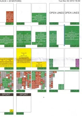
This is a copy of the page layout system they used, this particular one is for the 4th of November Issue. The green areas are where the adverts are placed and the pages with lots of boxes are the houses for sell pages. They work out where to put the stories around this layout.
The Fayre Photos


I didn't alter this picture very much, I merely cropped the picture and altered the saturation, cutting out the light that was streaming in. If I were to take this picture again I would definitely change the picture in order to make it a themed fayre for example' Halloween , which I originally wanted to do. However, a limited amount of time pervented me from doing this.


Again, I didn't do much to this picture: I cropped and altered the saturation (a bit more than the other) to make it more vibrant because the original picture seemed a bit dull. If there was anything I could change about this picture it would have to be the setting because I find that it doesn't look like a town hall.


Again, I didn't do much to this picture: I cropped and altered the saturation (a bit more than the other) to make it more vibrant because the original picture seemed a bit dull. If there was anything I could change about this picture it would have to be the setting because I find that it doesn't look like a town hall.
With this picture again I cropped and altered the saturation.
Library Pictures-Before and After


I didn't do much to these pictures at all, except to crop and alter the saturation slightly. When creating my pictures for my newspaper I needed to consider the transparency - the nature look of the picture rather than making it look like it was construction purposely. The altered pictures still look realistic and nature eventhough they have been altered to make them clearer and more interesting to look at.
Thursday, 21 October 2010
News Pictures Library and Rachel


What I wanted from this picture was ultimately have someone outside the old library smiling denoting the idea that they are happy with the fact that the library is moving to a bigger home. However, on taking the picture I found there were a few problems with it such as the boy in the background and the fact that I wanted it to be landscape to fit with my layout. If I learnt anything from this certain picture was that I should have considered arranging my layout around the picture ultimately making it easier in post production.
I altered the picture firstly by cropping the surrounding areas which were not needed in the picture. However, the boy in the background was still there- so I decided instead of retaking the picture that I would use the lasso tools to cut my model out of the picture then putting her on top of the boy therefore deleting him from the picture. By doing this, I also solved my other problem because by further cropping my picture was now landscape. For finishing touches, I altered the saturation slightly making the picture look at bit more vibrant.
Adverts- Beth's Flower Shop


Firstly to create this advert, I took a picture of a rose at a sligth angle to see the rose at it's bloom. On photoshop, I used the lasso tool to get rid of the unwanted background so I could emphasis that the rose is the focus of the advert. I found that also I had to clear the image up as the original picture was a bit blurry. Later, I added writing to the picture letting the reader know that this is an advert for a florist.
The vibrancy and fullness of the rose attracts the audiences attention making the florist worthy of recognition.
Adverts - Il Guardio's Restaurant


To create this advert, I took two separate pictures; one of a restaurant which lets off a feel of ambiance, while the other shows what the reataurant could possibly offer. I didn't change anything to either of the picture except I did sharpen up the picture of the cake as the original picture was a bit blurry. By combining the images and writing in a fancy font, it looks professional and emphasises that this place is classy.
I was very impressed with the outcome of this advert as I believe it looks thoroughly like a restaurant advert which many people would consider going to visit. It gives a sense that this certain place is the perfect place for a meal.
Adverts - The Photography Avert


To create this advert I used photoshop. Due to the fact that this advert is advertising photography I wanted to make it look arty and bright so I used the posterisation filter. However, I kept it subtle so it was still clear of what it is. Also, by having the picture of someone taking a picture makes it obivious what it is advertising. I used the rule of thirds to make the picture more interesting and to divert the viewers eyes to the camera. I also cropped the top of the picture because the top was boring and not needed in the picture. However, some may find that the advert may be a bit garish for a newspaper, but I like it because it's original and if anything it make my newspaper different.
The writing was kept simple because I wanted the picture to tell the story rather than the writing, the writing was there to give furthur details of the classes.
Other Headlines (3)
The long fight for new car parking has been won
The long awaited want for car parking around Mulberry had finally come. A campaign was launched at the end of last year and since then campaigners have been fighting for the cause. The issue of car parking came to the attention of the public when they realised that they didn’t have enough parking areas to accommodate the majority of the public. Over the last couple of years, Mulberry has grown in numbers of residents. Bridget Davids, the leader of the campaign informed us “the council are finally taking notice of the fact that we need more parking spaces. It is exciting to finally win this battle”. The council took notice of the campaign after numerous protests, fund raising schemes and visits from Bridget herself. The petition had approximately 90% of the town’s residents on it.Other Headlines (2)
Fayre goes down a 'Storm'.
Mulberry Fayre was a great success on Saturday; it went down a 'Storm' quite literally. The Annuual Autumn Fayre in Mulberry is an event which every local looks forward to every year and creates a great sense of community. The fayre was supposed to be held on one of the sunniest days of the year according to the weather report on the previous night. On waking up the next morning the residents of Mulberry saw the rain plummeting down outside. However the community would not allow the rain to deter them from the festivities. The local council and residents gathered together to put up marquees outside and use the town hall for their venue. Mary and Bob Hopkins commented that “it was probably the best fayre as far as they could remember”. There were stalls a plenty; sweets, face painting and jewelers’ stands. The most popular was the cake stand, Rebekah Morrison had to go home and make more cakes. All in all the day with a great success.
Other Headlines (1)
New Harry Potter Movie Casts a Spell on local Cinema
The most anticipated film of the year has reached Mulberry Cinema and gone off with a big bang. The first viewing was shown at two o’clock on Sunday. This provoked huge queues which made its way around the perimeter of the cinema. The awaiting audiences couldn’t contain their excitement. One fan said “I’ve been waiting for this film for what feels like a decade, I’m looking forward to seeing what happens to Harry”
The viewing has definitely boosted the Cinemas reputation and helped to revive it. Earlier in the year it was under threat of being closed down due to insufficient funds to keep it open. The Cinema owner Russell Turner said “At most of the year it is touch and go. We are limited to the amount of films we can show so many people take to going to the bigger cinema in the nearest city. Blockbusters such as Harry Potter are a blessing as they bring in the public and bring a great atmosphere with them”
The seventh and penultimate film in the saga has been adapted from J.K.Rowlings book ‘Harry Potter and the Deathly Shadows’ which has ultimately been split into two. The film see Harry, Ron and Hermione battling against time as well as evil to collect and destroy the Horcruxes, which contain parts of Voldemort’s soul.
My Main Headline
Library to Make a Move and Change for the Better.
Mulberry Library is finally set to make a move to a bigger home. The long awaited change is moving to its new building this Monday and will be opened by the nearest, the next Monday after.
Building and restorations have been going on for the past couple of months and now it is ready for furniture and books to slowly move in. The current Library will remain open during this process as it is still an active part of the society. The reason for the move was due to the fact that the Library is in high demand and that it cannot accompany as many people as they wish to.
Librarian Tora Jennings has said "The move is taking place and it is a very exciting time. I have seen inside the building and it will definitely be what the public want and should satisfy their needs. We have ordered new books and getting new computers which should be coming in later this week. I am thrilled to be involved in something so consequential for the local residents"
The Mulberry Council have asked for suggestions from the public on to what would be the best way forward, Mary Cartwright has said “It is all about the locals of Mulberry, we want to know what they want to get out of their Library. It is Important to consider them as they are the ones who will be spending most of their time in there”. The Library put a board outside for suggestions and there were many. Some were sensible and understanding like more seating, areas to work and more books in general. While others seemed a little bemusing, one suggestion specifically said they wanted a KFC. Other ideas for the Library were a toilet and a coffee shop.
The move hasn't come too soon for the locals of Mulberry as the library ceases to stop growing in its popularity. Students and adults alike take time to visit the library; some just for pleasure while others go there for work. The Library has been a source for learning and community for as long as the locals can remember.
One student in particular is glad for the up and coming changes to the Library "The Library is the place where I go mostly every day to do my work for school, it is a peaceful and pleasant atmosphere where you are able to concentrate." Rachel Jones 17, a student of Mulberry Secondary School commented "However, recently due to the huge number of people that go to the Library, it has almost been impossible to find a place in which I can study. It is my most important year and I feel the Library is a massive benefit. I'll be glad for the bigger space".
The Library is moving to a desolate building near the local supermarket, which I am sure will be good for a lot of people. The manager of Waitrose is also thoroughly glad for the change as it may increase the number of sales and be an active part in the support of the Library "We are hoping to support the Library any way we can".
The Library has definitely caused an excitement in and around the town of Mulberry and we can all see that it will be a great benefit in the near future for all the local residents. What we absolutely say that this move hasn't come far too soon.
Thursday, 23 September 2010
Possible Headlines
These are some of my ideas for Headlines to go into my Newspaper.
The Coloured Green Headlines are the stories I decided to pick, while the Red Coloured Headlines are ones I decided against:
- Library Set To Make A Move
- Library Set For A Change
- Community Gather Together For Cancer Appeal
- Annual Fete Is Big Hit With Locals
- New Harry Potter Film Shown at Local Cinema
- New Harry Potter Film Casts A Spell Over Local Cinema
- Police Capture Mass Graffiti Artist
- Campaign For More Seating Goes Ahead Around the Area
- Campaign For More Parking Goes Ahead
Due to the Fact that they are initial ideas - some of the Headlines varied to get the reader's attention. These are my Final Headlines:
- Library to make a move for the better (Front Cover)
- Library is nearly here; only one more week (Inside Cover)
- Fayre goes down a 'Storm' (Front Cover)
- Locals celebrate fayre despite the bad weather (Inside Cover)
- New Harry Potter movie casts a spell on local cinema (Short Story - Inside Cover)
- The long fight for new car parking has been won (Short Story - Inside Cover)
Monday, 20 September 2010
Inside Layout Initial Idea (2)

If this design came from any newspaper it was definitely inspired by the Mercury but with less pictures and adverts. I think at this moment in time I was almost set on committing to the other drafted design but I decided to keep my options open and to explore more ideas so I created this one. After designing it, I found that it was far too busy and similar to my front page with the boxed story/headline in the same position.
Inside Layout Initial Idea (1)

This particular layout I have designed reflected that of The Evening Post. When design I found I really liked the newspaper layout and convention as everything was was arranged neatly and clearly for the reader. I did changed some elements such as the bottom right sections by adding in a few more pictures as the Evening Post's inside page didn't have enough images for my liking- it was very text heavy. However, I loved and was set on doing the column of stories down the side as it has been a convention of newspapers that I have come to expect and appreciate over the years of viewing newspapers.
Initial Idea for Front Cover (3)

The element of local newspaper I used in the construction of this drafted design are as followed:
- The advert in the bottom left is inspired by the Mercury newspaper
- While the boxed image and story are inspired by the Times, also the other headline position is also influenced by the Times newspaper.
- By my third drafted design, I knew that my final design was going to consist of the newsline, advertising number and the website situated at the bottom of the page. I found it made the paper look professional and encouraged readers to call in and comment etc.
- The masthead and the adverts at the top of the page were inspired by the Evening Post's design. Also, I added in the stars as does the Evening Post which shows the tradition/ history of the newspaper.
I did like this design however I found that it bordered the lines of looking like a tabloid newspaper rather than a local (humble, community style) newspaper. I found that this design was suitable but not what I was looking for when considering what to make.
Initial Idea for Front Cover (2)

Elements used from local newspapers I have looked at:
- The bottom right hand advert came from the Evening Post
- While the newsline, advertising number and email at the bottom of the page comes from the Times newspaper - I believe this makes a newspaper look more professional
- I also added in the places you could buy the newspaper similar to that of the Mercury and the Times.
- The number of pictures was also inspired by the The Times newspaper as when analysing I found it to be more appropriate and tidier in it's layout.
- By adding a slogan, it reflected the Evening Post
- Later on in the design process I decided on adding in a logo of a blackberry similar to what both the Evening Post and the Mercury have.
Intial Idea for Front Cover (1)

This Idea has been constructed from a mixture of the three newspapers I have looked at through my research:
- The three adverts at the bottom of the page and the line dividing the adverts from the main story reflect that of The Times Newsapaper
- While the Mast head is similair to the Mercury as it stretches across the page accompianied by the logo
- The main headline and the boxed story/image are ideas from a combination of the Mercury and the Times
This idea is pretty simplistic and doesn't have enough features on it that may make it look more professional and conventional of a real media newspaper. If I were to improve this, I would consider filling the page with more images and perhaps moving the adverts around.
Newspaper Inside Page Layouts


Features seen on the inside covers:
The Evening Post:
- Caption - who's in the picture, age and where it is shot - who, what, where, why etc. for example: Sam Rogers 6 and tom Anderson 13, winners of the first golden Morphs award @ Bristol Explore presented by Richard Williams (Who Framed Roger Rabbit) and Donna Speed (Competition winner)
- column of stoies on the left hand side approximately three stories.
- One image, more focus on stories
- six stories on one page.
- Evening post website, top left
- Date top right
- who took the picture is also featured and where you can order the picture.
I like the layout of the stories especially the left hand column. Perhaps I would add another picture and an advert as I believe there are too many stories all on one page.
The Mercury:
- Captions under/ alongside pictures
- top left corner - name of newspaper and then date
- top right cormer - website address
- One large advert bottom left of the page
- Two images
- Community stories in a blue rimmed box
- Maximum two to three columns for each story
- approximately three stories per page
Again, I like the layout and there is the right amount of pictures : text
The Times:
- website address -top left hand corner
- date - middle top of page
- page number - top right hand corner
- seven adverts on one page near bottom and up the sides but I think that it may vary between pages
- three images near top of page
- approximately three stories per page
- Red line separting the two headlines
I like the layout at the top of the page as it is more conventional but I do feel that it has too many adverts which ultimately make it feel cluttered.
Times - Analysis


This is by far by favourite newspaper layout and I definitely took most of my inspiration from this paper. I like the way the masthead sticks to the top left hand side of the page with an advert on the right. However, I don't really like the three adverts at the bottom of the page as they seemingly take up about 1/3 of the space, then finding the rest a bit cramped together. Although I wouldn't chose this for my paper, I can appreciate that it brings in a lot of the papers revenue.
Other features:
- the newsline, advertising line and email address are all clearly shown on the front page
- the areas where it is sold is shown above the masthead
- the reporters name is always under the headline followed by the reporters work email address.
- There is the ABC figures mark on the front suggesting that the circulation figures can be found on the website.
- the main headlines introduction is in bold
- the main headline only uses capitals for the first letter of the title
- the sub-story is divided from the main headline with a red rim around the edge of it
- there is a shadow behind the masthead making the masthead come out of the page.
Mercury - Analysis


I perferred the 'Mercury' layout to the 'Evening Post'. To me this newspaper represented a community feel that cares about its local people a lot more. However, they 'Mercury' is a lot more focused on specific areas for example: Clevedon, Nailsea, Portishead and Yatton. They state this at the top right hand corner of the page showing where the newspaper is sold and posted. Unlike, 'The Evening Post' the mast head is situated central at the top of the page and doesn't use capitals for all the letters. I find that the use of an all capital masthead was the thing that made the 'Evening Post' look more like a tabloid newspaper. I do think that the 'Mercury' masthead is some what more interesting and I really like the font used. The colour schemes is also something I am in favour of, the blue, white and black seems to make it look less fromal and more laid back but still holds a prefessional feel and look. The masthead is also outlined with two blue sections which tell of minor details about the newspaper itself. Again, I like the ratio of pictures, adverts and headlines as they are equal and well spaced out however if I was being picky I would say that many there could be one more story to add more interest to the cover.
On one of the covers, they had a box with a minor story and picture in it. The story was of a local fete and did continue on the other page, but the thing that interested me about that section was the picture os smiling faces, which represented the community at it's best. This is partially why I decided on making my newspaper locally based as you could add more characters and meaning into the stories. The adverts are all taken from local businesses eg. Freeman in Portishead which like 'The Evening Post' shows support and enhances the locality of the newpaper.
The Evening Post - Analysis


When analysing the 'Evening Post', I was looking at the specific conventions and story lines that it contains. I found that this particular newspaper follows a typical convention of a tabloid newspaper rather than a broadsheet as each section is blocked off from each other.The front cover is a simple layout which I think sometimes looks more effective and professional in its approach. There is a good balance between pictures, adverts and stories. All the adverts are related to the newspaper itself and the local area for example "Save £££s on City and Rover Tickets" which shows that they are thinking about what the locals would want and they are supporting their own local businesses. I like the idea of having a slogan "At the heart of all things local", in this simple but effective sentence they are telling the reader exactly what they can get from the newspaper. It is a kind of a promise to their audiences that a local community is important to them.
One thing I do not like is the three adverts at the top of the page, I preferred the Masthead to be situated at the top of the page like in the 'Times' and 'Mercury' layouts. I feel that the layout seems more like that of a tabloid newspaper as everything is put into blocks. I did like the blue section underneath the masthead stating the the price and date of the issue though, it separates the masthead from the main headlines which I find thoroughly interesting. It seems to highlight the masthead. Another thing I did find interesting from looking at the different layouts of newspapers is that they like to make the layout slightly disjointed and separated, clearly indicating the different stories and adverts. Also they all have their own specific design which makes them recognisable to their readers.
Friday, 17 September 2010
A2 Media - First Thoughts
For my A2 Media production, I have decided to make a Local Newspaper. The reasons behind making it is to enhance my knowledge of real print media conventions and to expericence at first hand how to make a newspaper. I am looking forward to constructing a newspaper and writing articles.
Subscribe to:
Posts (Atom)