- The picture is important
- Need to grab attention/creating an impact through strong headlines
- Capitals which are punchy making a point
- Should write the headlines first and arrange the page around
- By-line within the story
- Paragraphing after 1st para indented
- More columns of writing the better
- Think about pictures - cropping etc.
- Teasers - highlights of what's inside
- Inside and front -fonts all the same - Times New Roman, makes it neater/tidier
- captions with pictures - different font from the body of the text
- Inside page - start by placing picture, then one single column of stories down the side
- width of columns -set/decide for both pages - 5 across whole page.
- Design in A3 - font size 9
- Body copy font 8 1/2 - 9 points
- Tabloid 80 - 100 point type
- 70 - 80p size - headline (not in tabloid)
- 24p -small headlines
- 66p text (main) - captions same size but different font
- Print off to see size of headlines and everything
- Don't go too flashy
- Most of the money is achieved through the adverts
- Don't use any colours you wouldn't want to wear - not too flashy
- Not too much in each a paragraph - only a few sentences in each - smaller the better.
- Adverts - same width as story
I found this advice from someone high up in the newspaper/print industry to be thoroughly useful and incredibly interesting. I found myself refering to these notes quite often and taking this advice to improve my work and make it more professional. I have followed most these key features of the conventions used in 'The Evening Post' but not all as I wanted to vary my Newspaper, so that I wasn't at risk of copying - I wanted to have my own idea as well as those from 'The Evening Post'.


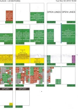
This is a copy of the page layout system they used, this particular one is for the 4th of November Issue. The green areas are where the adverts are placed and the pages with lots of boxes are the houses for sell pages. They work out where to put the stories around this layout.
No comments:
Post a Comment