Thursday 23 September 2010

Possible Headlines

These are some of my ideas for Headlines to go into my Newspaper.
The Coloured Green Headlines are the stories I decided to pick, while the Red Coloured Headlines are ones I decided against:
  • Library Set To Make A Move
  • Library Set For A Change
  • Community Gather Together For Cancer Appeal
  • Annual Fete Is Big Hit With Locals
  • New Harry Potter Film Shown at Local Cinema
  • New Harry Potter Film Casts A Spell Over Local Cinema
  • Police Capture Mass Graffiti Artist
  • Campaign For More Seating Goes Ahead Around the Area
  • Campaign For More Parking Goes Ahead
Due to the Fact that they are initial ideas - some of the Headlines varied to get the reader's attention. These are my Final Headlines:
  • Library to make a move for the better (Front Cover)
  • Library is nearly here; only one more week (Inside Cover)
  • Fayre goes down a 'Storm' (Front Cover)
  • Locals celebrate fayre despite the bad weather (Inside Cover)
  • New Harry Potter movie casts a spell on local cinema (Short Story - Inside Cover)
  • The long fight for new car parking has been won (Short Story - Inside Cover)

Monday 20 September 2010

Inside Layout Initial Idea (2)


If this design came from any newspaper it was definitely inspired by the Mercury but with less pictures and adverts. I think at this moment in time I was almost set on committing to the other drafted design but I decided to keep my options open and to explore more ideas so I created this one. After designing it, I found that it was far too busy and similar to my front page with the boxed story/headline in the same position.

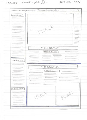
Inside Layout Initial Idea (1)


This particular layout I have designed reflected that of The Evening Post. When design I found I really liked the newspaper layout and convention as everything was was arranged neatly and clearly for the reader. I did changed some elements such as the bottom right sections by adding in a few more pictures as the Evening Post's inside page didn't have enough images for my liking- it was very text heavy. However, I loved and was set on doing the column of stories down the side as it has been a convention of newspapers that I have come to expect and appreciate over the years of viewing newspapers.

Initial Idea for Front Cover (3)


The element of local newspaper I used in the construction of this drafted design are as followed:
  • The advert in the bottom left is inspired by the Mercury newspaper
  • While the boxed image and story are inspired by the Times, also the other headline position is also influenced by the Times newspaper.
  • By my third drafted design, I knew that my final design was going to consist of the newsline, advertising number and the website situated at the bottom of the page. I found it made the paper look professional and encouraged readers to call in and comment etc.
  • The masthead and the adverts at the top of the page were inspired by the Evening Post's design. Also, I added in the stars as does the Evening Post which shows the tradition/ history of the newspaper.

I did like this design however I found that it bordered the lines of looking like a tabloid newspaper rather than a local (humble, community style) newspaper. I found that this design was suitable but not what I was looking for when considering what to make.

Initial Idea for Front Cover (2)


Elements used from local newspapers I have looked at:
  • The bottom right hand advert came from the Evening Post
  • While the newsline, advertising number and email at the bottom of the page comes from the Times newspaper - I believe this makes a newspaper look more professional
  • I also added in the places you could buy the newspaper similar to that of the Mercury and the Times.
  • The number of pictures was also inspired by the The Times newspaper as when analysing I found it to be more appropriate and tidier in it's layout.
  • By adding a slogan, it reflected the Evening Post
  • Later on in the design process I decided on adding in a logo of a blackberry similar to what both the Evening Post and the Mercury have.
This idea was by far my favourite as I feel the spacing and the layout fitted perfectly and reflected a real local newspaper. I also felt I could work with it better in the actual process of constructing it as it was the one I preferred.

Intial Idea for Front Cover (1)


This Idea has been constructed from a mixture of the three newspapers I have looked at through my research:
  • The three adverts at the bottom of the page and the line dividing the adverts from the main story reflect that of The Times Newsapaper
  • While the Mast head is similair to the Mercury as it stretches across the page accompianied by the logo
  • The main headline and the boxed story/image are ideas from a combination of the Mercury and the Times

This idea is pretty simplistic and doesn't have enough features on it that may make it look more professional and conventional of a real media newspaper. If I were to improve this, I would consider filling the page with more images and perhaps moving the adverts around.

Newspaper Inside Page Layouts


Features seen on the inside covers:
The Evening Post:

  • Caption - who's in the picture, age and where it is shot - who, what, where, why etc. for example: Sam Rogers 6 and tom Anderson 13, winners of the first golden Morphs award @ Bristol Explore presented by Richard Williams (Who Framed Roger Rabbit) and Donna Speed (Competition winner)
  • column of stoies on the left hand side approximately three stories.
  • One image, more focus on stories
  • six stories on one page.
  • Evening post website, top left
  • Date top right
  • who took the picture is also featured and where you can order the picture.

I like the layout of the stories especially the left hand column. Perhaps I would add another picture and an advert as I believe there are too many stories all on one page.

The Mercury:

  • Captions under/ alongside pictures
  • top left corner - name of newspaper and then date
  • top right cormer - website address
  • One large advert bottom left of the page
  • Two images
  • Community stories in a blue rimmed box
  • Maximum two to three columns for each story
  • approximately three stories per page

Again, I like the layout and there is the right amount of pictures : text

The Times:

  • website address -top left hand corner
  • date - middle top of page
  • page number - top right hand corner
  • seven adverts on one page near bottom and up the sides but I think that it may vary between pages
  • three images near top of page
  • approximately three stories per page
  • Red line separting the two headlines

I like the layout at the top of the page as it is more conventional but I do feel that it has too many adverts which ultimately make it feel cluttered.

Times - Analysis


This is by far by favourite newspaper layout and I definitely took most of my inspiration from this paper. I like the way the masthead sticks to the top left hand side of the page with an advert on the right. However, I don't really like the three adverts at the bottom of the page as they seemingly take up about 1/3 of the space, then finding the rest a bit cramped together. Although I wouldn't chose this for my paper, I can appreciate that it brings in a lot of the papers revenue.
Other features:
  • the newsline, advertising line and email address are all clearly shown on the front page
  • the areas where it is sold is shown above the masthead
  • the reporters name is always under the headline followed by the reporters work email address.
  • There is the ABC figures mark on the front suggesting that the circulation figures can be found on the website.
  • the main headlines introduction is in bold
  • the main headline only uses capitals for the first letter of the title
  • the sub-story is divided from the main headline with a red rim around the edge of it
  • there is a shadow behind the masthead making the masthead come out of the page.

Mercury - Analysis


I perferred the 'Mercury' layout to the 'Evening Post'. To me this newspaper represented a community feel that cares about its local people a lot more. However, they 'Mercury' is a lot more focused on specific areas for example: Clevedon, Nailsea, Portishead and Yatton. They state this at the top right hand corner of the page showing where the newspaper is sold and posted. Unlike, 'The Evening Post' the mast head is situated central at the top of the page and doesn't use capitals for all the letters. I find that the use of an all capital masthead was the thing that made the 'Evening Post' look more like a tabloid newspaper. I do think that the 'Mercury' masthead is some what more interesting and I really like the font used. The colour schemes is also something I am in favour of, the blue, white and black seems to make it look less fromal and more laid back but still holds a prefessional feel and look. The masthead is also outlined with two blue sections which tell of minor details about the newspaper itself. Again, I like the ratio of pictures, adverts and headlines as they are equal and well spaced out however if I was being picky I would say that many there could be one more story to add more interest to the cover.
On one of the covers, they had a box with a minor story and picture in it. The story was of a local fete and did continue on the other page, but the thing that interested me about that section was the picture os smiling faces, which represented the community at it's best. This is partially why I decided on making my newspaper locally based as you could add more characters and meaning into the stories. The adverts are all taken from local businesses eg. Freeman in Portishead which like 'The Evening Post' shows support and enhances the locality of the newpaper.

The Evening Post - Analysis


When analysing the 'Evening Post', I was looking at the specific conventions and story lines that it contains. I found that this particular newspaper follows a typical convention of a tabloid newspaper rather than a broadsheet as each section is blocked off from each other.The front cover is a simple layout which I think sometimes looks more effective and professional in its approach. There is a good balance between pictures, adverts and stories. All the adverts are related to the newspaper itself and the local area for example "Save £££s on City and Rover Tickets" which shows that they are thinking about what the locals would want and they are supporting their own local businesses. I like the idea of having a slogan "At the heart of all things local", in this simple but effective sentence they are telling the reader exactly what they can get from the newspaper. It is a kind of a promise to their audiences that a local community is important to them.
One thing I do not like is the three adverts at the top of the page, I preferred the Masthead to be situated at the top of the page like in the 'Times' and 'Mercury' layouts. I feel that the layout seems more like that of a tabloid newspaper as everything is put into blocks. I did like the blue section underneath the masthead stating the the price and date of the issue though, it separates the masthead from the main headlines which I find thoroughly interesting. It seems to highlight the masthead. Another thing I did find interesting from looking at the different layouts of newspapers is that they like to make the layout slightly disjointed and separated, clearly indicating the different stories and adverts. Also they all have their own specific design which makes them recognisable to their readers.

Friday 17 September 2010

A2 Media - First Thoughts

For my A2 Media production, I have decided to make a Local Newspaper. The reasons behind making it is to enhance my knowledge of real print media conventions and to expericence at first hand how to make a newspaper. I am looking forward to constructing a newspaper and writing articles.