Thursday 18 November 2010

Subsidiary Task 2 - Radio Advert Script

This is a draft for my Radio Advert which is promoting my newspaper, the 'Mulberry Post':

Character voices – Joan and Edith


(Birds Tweeting and Church bells ringing in background)


Joan – (surprised voice) Good Morning Edith, fancy seeing you here!?

Edith – Morning Joan, Lovely day today, isn't it?

J – Lovely indeed– just the perfect day to read the Mulberry Post in the park, don't you think?

E – The Mulberry Post in the park? Splendid idea Joan– the perfect way to start off your day

J – It is indeed Edith!

E – They do say The Mulberry Post is 'The Heart of our Community”

J – (positively said) They do indeed Edith, they do indeed.


I found that it needed to say more about what the Newspaper can give the reader as an incentive to go buy the paper- so I added in an extra bit of dialogue still featuring Edith and Joan:


Edith: This week you can pick up your chance to win a once in a lifetime trip to Australia

Joan: Oh, isn't that Splendid!


Start singing /talking – Mulberry, Mulberry, Mul-Mul-M-m-Mulberry Post! - In the end I decided to get rid of this idea and replace it with a jingle created by several sounds from soundbible.com.


I constructed the whole advert on GarageBand - a program on the Mac computers. By using this I found it fairly easy to make my advert sound relatively realistic. Having two characters in my advert allowed me to create a narrative of two elder women who live in a small village. I believe they are fairly stereotypical old women as they love to natter on about their favourite topics. They emphasise that their community Newspaper is the best through the repetition of the name 'The Mulberry Post'.

However, I had to think about what was relevant to put in the advert because it is only supposed to be 30 seconds long. The final version has gone over by about 3 seconds but I couldn't cut anymore out because I felt it was all needed to keep the character of the piece through out the advert.

I decided that my advert would work best if it was cheesy after hearing local radio adverts. Also a sales pitch promoting a 'once in a lifetime' trip to Australia would ecourage the reader to buy the newspaper.

Other examples of adverts (Newspaper)

These adverts do not advertise newspapers but do follow similar lines. I found them thoroughly interesting as they are translating a message to the reader/viewer that a journalist's job can be very dangerous- it is an advert of awareness. I have added them into my blog to show that adverts which seem pretty simplistic can be really effective. Your focus is drawn to the close-up of the pens/pencil seeing the damage in which these instruments have been subjected to. At first glance you can identify that this pen/pencil has been chewed, damaged etc. You could say that it is representing your life as well as the journalists because it addresses the audience. It is also creating a narrative which is shocking.


Subsidiary Task 1 - Example Adverts for a Newspaper

Here are some examples of adverts that newspapers have used to promote their newspaper.

I find this advert promoting the 'The Times' Newspaper really interesting. The idea of using ballet accompanied with the dark lighting and the staging makes the Newspaper seem more dramatic. You could even say that it makes it seem elegant and professional. It is also rather humorous as the ballet dancer (in the midst of a jump) is reading the newspaper really casually suggesting an easy, pleasurable read. The advert is also supported by a quick slogan "A short, sharp read" promoting the idea that the Newspaper is easy and leisurely to read. I find that the advert is simplistic but doesn't loss its meaning - however I think that at first glance you may not understand or see the full extent of what the advert is advertising.


The 'Financial Times' is incredibly interesting and attracts your attention because of the objects missing. The adverts are intertextual as the pictures possibly refer to recent events at the time when the advert was made. However due to the missing object you can see that there is another connotation. This runs alongside the text saying "Some tools aren't a luxury" later relating to the slogan "We live in FINANCIAL TIMES" perhaps suggesting the current recession. It emphasises the point that the newspaper is up-to-date with all the news. Again the advert seem simplistic in its approach to advertising. It also implies that it is Interactive due to the website address clearly displayed on the poster.


'The Star' is another Newspaper advert but it takes a different approach to the 'Financial Times' and 'The Times'. It is simplistic but effective. The reasoning behind the newspaper made into a plane is because it sponsors the RAF Air Show. This shows the newspaper to have a care for the people in the news at that particular moment in time. The slogan 'We're up there with the best' creates the image that this newspaper has confidence in its journalistic methods and views. The minimal colours on the poster also adds to how effective the poster is connoting the idea that it's about what is inside the paper.


I really like the 'Guardian' newspaper advert due to the colours and its presentation which ultimately draws the viewers attention. At first you may not realise that the poster is advertising 'The Guardian' as it isn't the central focus. Instead, it comments "Obessive Detail" which could connote that the newspaper is something that the reader could not live without as it also follows up below. Other readings could suggest that the newspaper is obessive with the detail it puts into it's stories implying the importance for the newspaper to be informative and in detail. The actual features are in a smaller print to inform the reader what they can expect.
The advert is simplistic again suggesting its what is inside the paper that is important.

Thursday 11 November 2010

Evening Post Visit 03/11/10


On the 3rd of November, myself and 2 other Media Students made a visit to 'The Evening Post' in Bristol. We sat in on a meeting where they were deciding what headlines to use and where they should go. This was thoroughly interesting as it gave us an insight into the world of print journalism and how a newspaper is put together.

Later on we had a talk with the Deputy Editor Rob Stokes who gave us tips on how we should/could put our newspaper together. He ran through various techniques and elements in which are needed to make a newspaper look professional.

Some of the things he said which we could take into consideration:


  • The picture is important

  • Need to grab attention/creating an impact through strong headlines

  • Capitals which are punchy making a point

  • Should write the headlines first and arrange the page around

  • By-line within the story

  • Paragraphing after 1st para indented

  • More columns of writing the better

  • Think about pictures - cropping etc.

  • Teasers - highlights of what's inside

  • Inside and front -fonts all the same - Times New Roman, makes it neater/tidier

  • captions with pictures - different font from the body of the text

  • Inside page - start by placing picture, then one single column of stories down the side

  • width of columns -set/decide for both pages - 5 across whole page.

  • Design in A3 - font size 9

  • Body copy font 8 1/2 - 9 points

  • Tabloid 80 - 100 point type

  • 70 - 80p size - headline (not in tabloid)

  • 24p -small headlines

  • 66p text (main) - captions same size but different font

  • Print off to see size of headlines and everything

  • Don't go too flashy

  • Most of the money is achieved through the adverts

  • Don't use any colours you wouldn't want to wear - not too flashy

  • Not too much in each a paragraph - only a few sentences in each - smaller the better.

  • Adverts - same width as story

I found this advice from someone high up in the newspaper/print industry to be thoroughly useful and incredibly interesting. I found myself refering to these notes quite often and taking this advice to improve my work and make it more professional. I have followed most these key features of the conventions used in 'The Evening Post' but not all as I wanted to vary my Newspaper, so that I wasn't at risk of copying - I wanted to have my own idea as well as those from 'The Evening Post'.


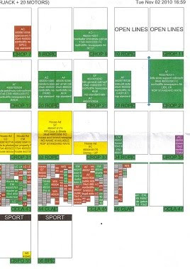
This is a copy of the page layout system they used, this particular one is for the 4th of November Issue. The green areas are where the adverts are placed and the pages with lots of boxes are the houses for sell pages. They work out where to put the stories around this layout.

The Fayre Photos

I didn't alter this picture very much, I merely cropped the picture and altered the saturation, cutting out the light that was streaming in. If I were to take this picture again I would definitely change the picture in order to make it a themed fayre for example' Halloween , which I originally wanted to do. However, a limited amount of time pervented me from doing this.


Again, I didn't do much to this picture: I cropped and altered the saturation (a bit more than the other) to make it more vibrant because the original picture seemed a bit dull. If there was anything I could change about this picture it would have to be the setting because I find that it doesn't look like a town hall.
With this picture again I cropped and altered the saturation.

Library Pictures-Before and After


I didn't do much to these pictures at all, except to crop and alter the saturation slightly. When creating my pictures for my newspaper I needed to consider the transparency - the nature look of the picture rather than making it look like it was construction purposely. The altered pictures still look realistic and nature eventhough they have been altered to make them clearer and more interesting to look at.